Though my sewing skills are pretty remedial, I have a bit of an obsession with fabric (and paper) and I like being able to choose the right print for the right project. No matter how simple it is. I love that if I can’t find what I’m looking for, I can easily make a design and have it printed on the fabric of my choice.
Some of the easier sewing projects I’ve had success with are pillow covers and curtains. Basically, anything that requires sewing in a straight line. Though pillow covers can get tricky if a zipper is needed.
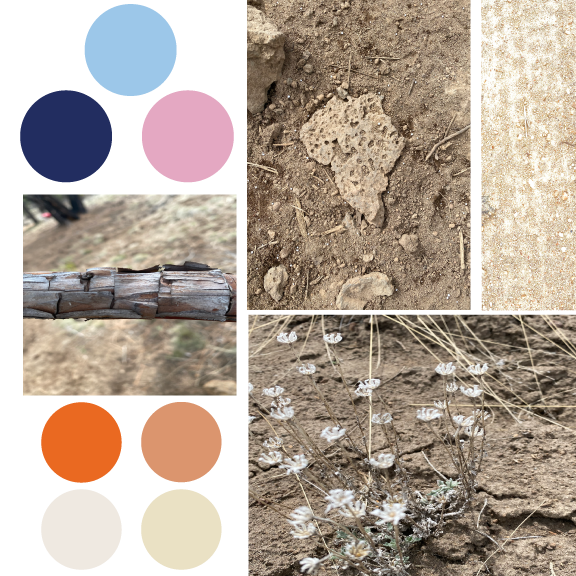
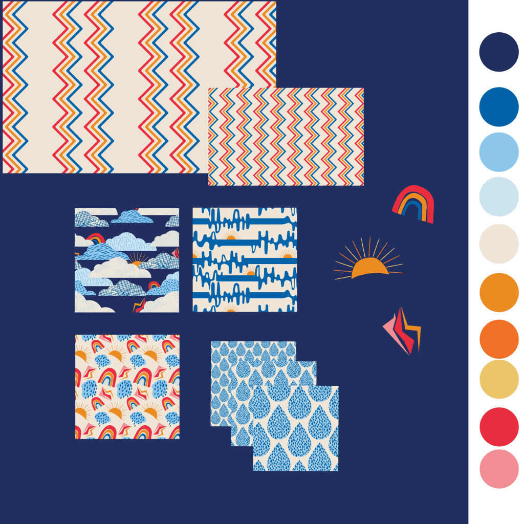
Here are a few mock-ups of patterns from my collection, “Unleashed, Rain or Shine” which was completed this year. Click on the linked photos to see more!
“Just a Sprinkle”, available in small, medium, and large scale on Spoonflower.
Spoonflower offers a minky fabric perfect for a cozy throw. Or any other cozy items you might want to make.
This print is called “Eye on the Ball” and is available in large and small scale. It was a fun design to make and ended up being completely different from the original idea.
A mock-up of a lumbar pillow showing “Explore!”, a somewhat of a Memphis design-inspired pattern.
Of course, if sewing isn’t exactly in your wheelhouse Spoonflower gives you the option of being able to order home decor items with your choice of designs on them. But why not dust off that sewing machine in honor of National Thread the Needle Day and have some fun?
Unleashed, Rain or Shine is now available on Spoonflower
Happy sewing! If by chance you order from my shop, I would really love for you to show me what you’ve made. Feel free to tag me on Instagram @twistnpout13 or leave a link in the comments here.
For many months I have had some ideas about how to use these shapes in a pattern, maybe a whole collection. I’m still kicking the idea around. Looking for inspiration everywhere these days. But can you look for inspiration or does inspiration find you?
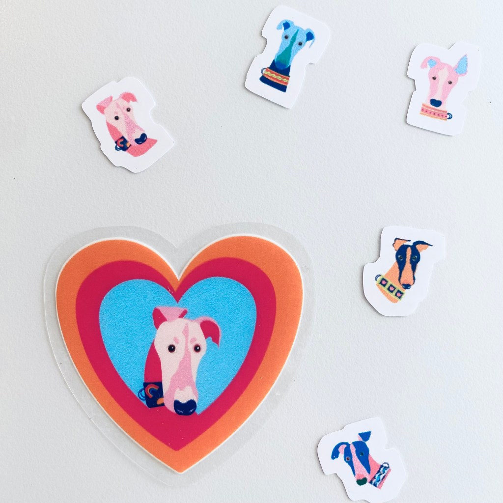
I realized while designing that these colors were a little crazy. But I think they’re actually pretty fun stickers. Now available on available on Red bubble.
This week I wanted to get back to this design I started a few months ago. How to capture the foliage, show variety and all the different shades of green is turning out to be a challenge. I originally did a few hand drawn doodles for the variation in leaf patterns, but I don’t think it is a good fit with the rest of the motifs. Well, the good news is all the parts are here, I have plenty to work with.
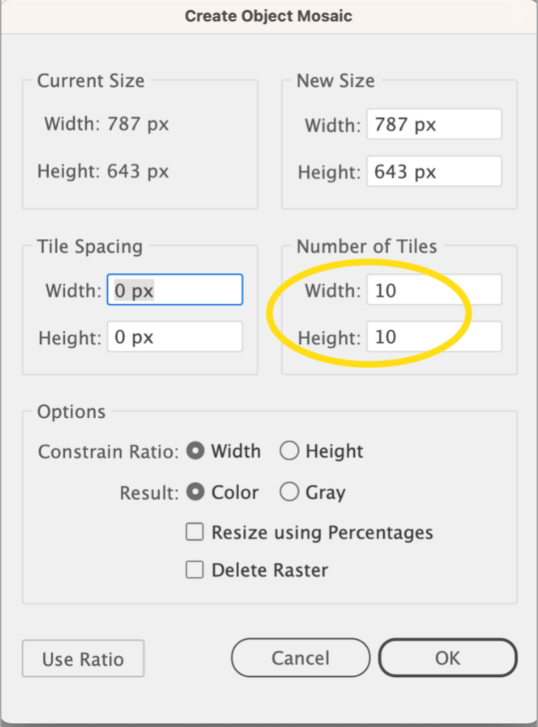
One of my favorite things to do in Illustrator is to make color palettes, usually from photos I take or photos I access through a site like Unsplash. Using “Create Object Mosaic” makes this an easy and oddly satisfying task. Color is actually a complicated subject and there is a very scietific way to choose colors that work well together. But for someone who is just learning, I don’t think there is anything wrong with playing around with color palettes and just picking colors you love without thinking too much about color theory.
I’ve taken many classes on Illustrator from a variety of sources but this little Mosaic tip was only ever mentioned by one instructor, Helen Bradley. I don’t know why this tool isn’t mentioned more often as a way to create a color palette in a snap but I thought I’d share it with you here.
This isn’t an Illustrator tutorial, or a color theory class, just a quick intro to the Mosaic tool, so you should already have a pretty good grasp of Illustrator basics.
Even though I can really geek out using my eyedropper tool to pull colors from a photo, there are times when I want to speed up the process. Also, there are times when I can’t quite get the eye dropper to grab the exact shade I want, so I’ll often create a mosaic so I can better isolate a tiny bit of the perfect color.
You can try this by first placing the photo you want to use to build your palette in your document.
Since I usually delete my photo once I’ve collected my colors, I don’t embed the photo. If you go to activate the mosaic tool and see it is greyed out, meaning it is not accessible, you may need to embed your photo first.
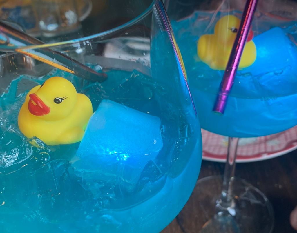
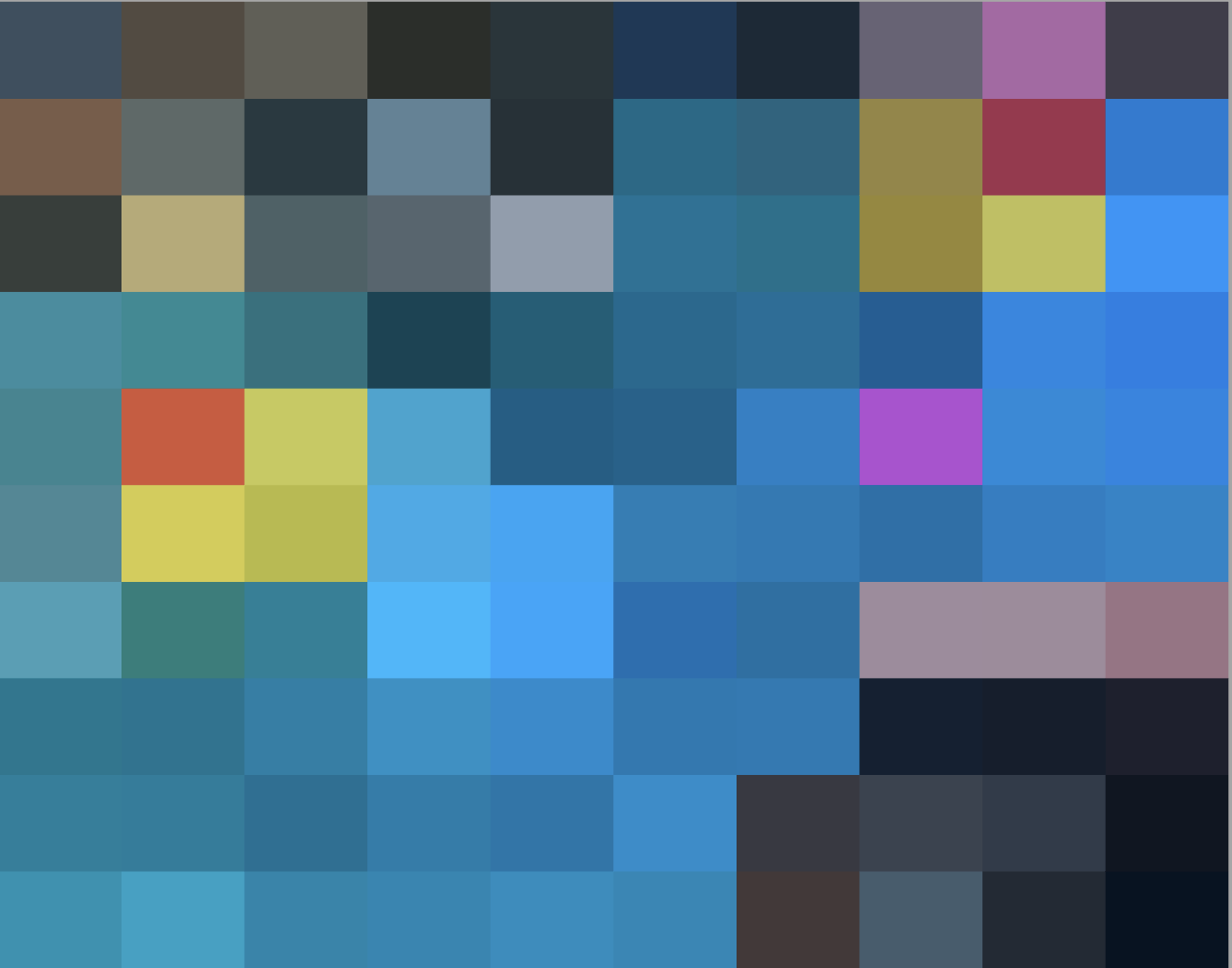
I’m going to use this photo of the most adorable cocktail I’ve ever seen. This bright and fun concoction was served up at Farmhouse Kitchen Thai Cuisine located in the Pearl District of Portland OR. And BTW, their food is delicious too!
Next, with the photo selected, go up to the top menu and select object then scroll down to create object mosaic.
Don’t concern yourself with any of the settings except for the number of tiles. You can leave it on the default of 10 or, depending on how many of the fine detail colors you want to grab, increase the number of tiles.
Here is my photo using the default of 10 columns and 10 rows.
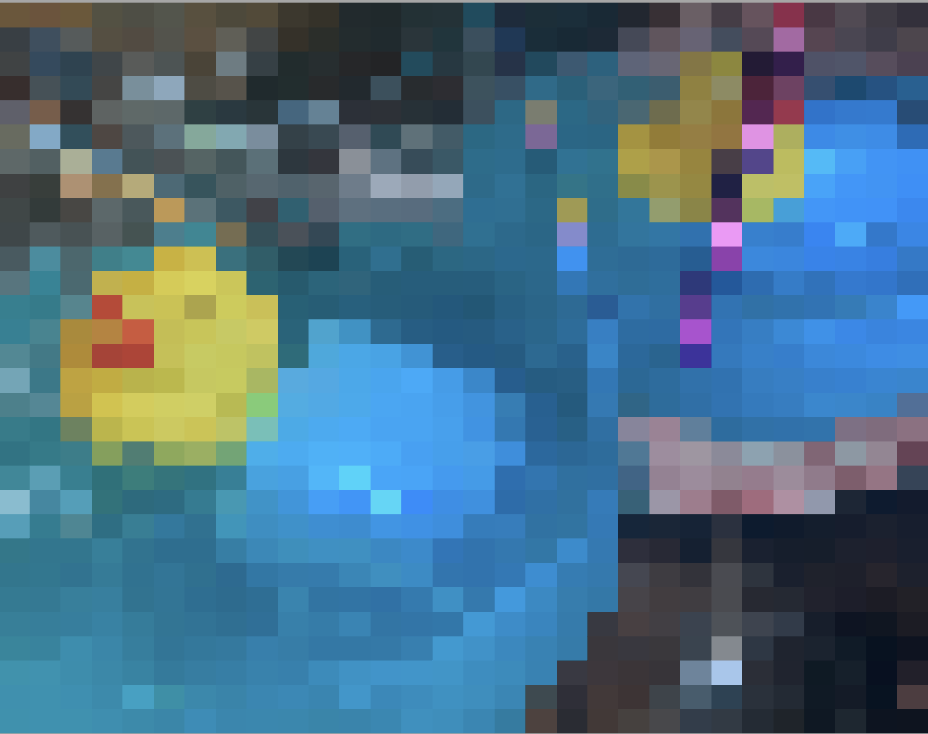
Here’s the same photo set to 30 and 30.
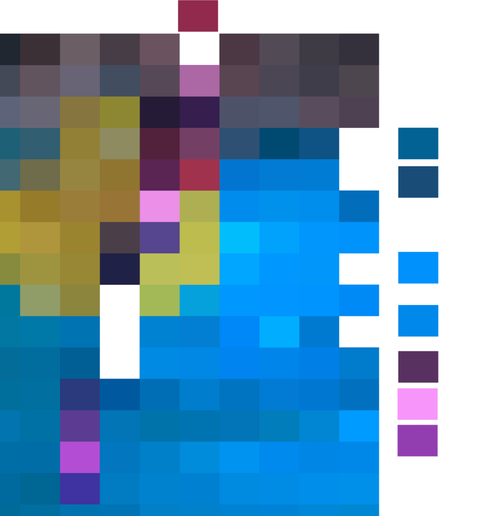
Your photo will still be intact and is a separate object under the mosaic so you can select it and move it off your photo. But even better than that, you can pull out all these colors separately.
To do that, select the photo mosaic and ungroup it. Now you can pull out each individual square!
You can see here with the mosaic ungrouped, I pulled out a few of the tiles I want to use for my palette.
Continue to pull out a few (or a lot) of key colors you want to use in your design.
Once you have all your colors arranged outside the mosaic, select all of them to make a color group to add to your swatches panel. Don’t forget to save them to your library for later use in a new file. You can further fine tune your palette by using more precise techniques. This can take a while, but I find in the beginnng stages of my process, just grabbing colors is the esiest way to get started.
How quick, easy and fun is that? Again, a big shout out to Helen Bradley for this nifty trick. You can find Helen on Skillshare and YouTube where she teaches TONS of classes on designing in Illustrator and Photoshop. Her classes get right to the nitty-gritty of the topic and she explains every step clearly.
Anyway, that’s it for now. Hope you learned something new and helpful. Let me know if you have ever used the mosaic tool for anything other than to create a color palette.
WE HAVE GLITTER! I’ve always wanted to try making glitter in Adobe Illustrator but didn’t have the patience to see it through. I thought now would be a good time to try that out.
I created the glitter for this celebratory cupcake by watching Graphic Design with Elena on YouTube. Elena made it so easy to follow along and even though her tutorial was centered on gold glitter, I used her exact technique to make red, blue, and silver glitter. I also discovered the recolor artwork tool was a HUGE time saver with this project. Though I still need to master patience to really create the best glitter, I was able to go through this process rather quickly.
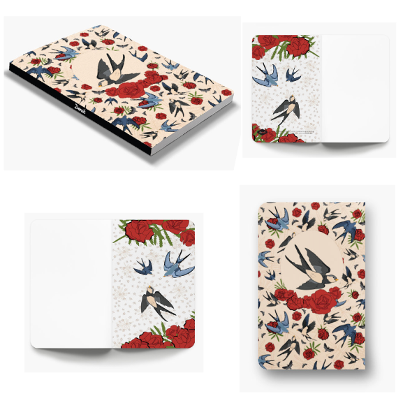
As a special graduation gift for completing Immersion 23 with Bonnie Christine, all students were gifted the opportunity to create their own personalized notebooks by Denik! What a great way to put all the skills we’ve learned in Adobe Illustrator to the test.
As usual, I waited til the last minute to finally get my act together to sit down and do it. I wanted to create something special, but the thought of creating something from scratch was just too daunting a task at the time, so I decided to use a few motifs I had already created. I have other plans for these designs but figured, why not? Especially as the time started sneaking up on me.
I’ve seen Denik notebooks in bookstores. They always have such beautiful designs and are superb quality too. Honestly, though this is my first time owning one and I had no idea you could make your very own personalized notebook on their website. I created my designs in Illustrator, but you could use a site like Canva or Picmonkey to make your design and then upload it to the Denik website. If you want to get really fancy, you could even embellish your design with GOLD FOIL! Be still my heart. You could also opt to remove their logo, but I actually like it; Makes me feel like I designed for an actual company (a girl can dream right?).
Next time I need a special gift for someone I will definitely be planning and designing a notebook or journal through Denik. What a perfect gift!
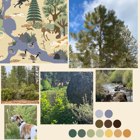
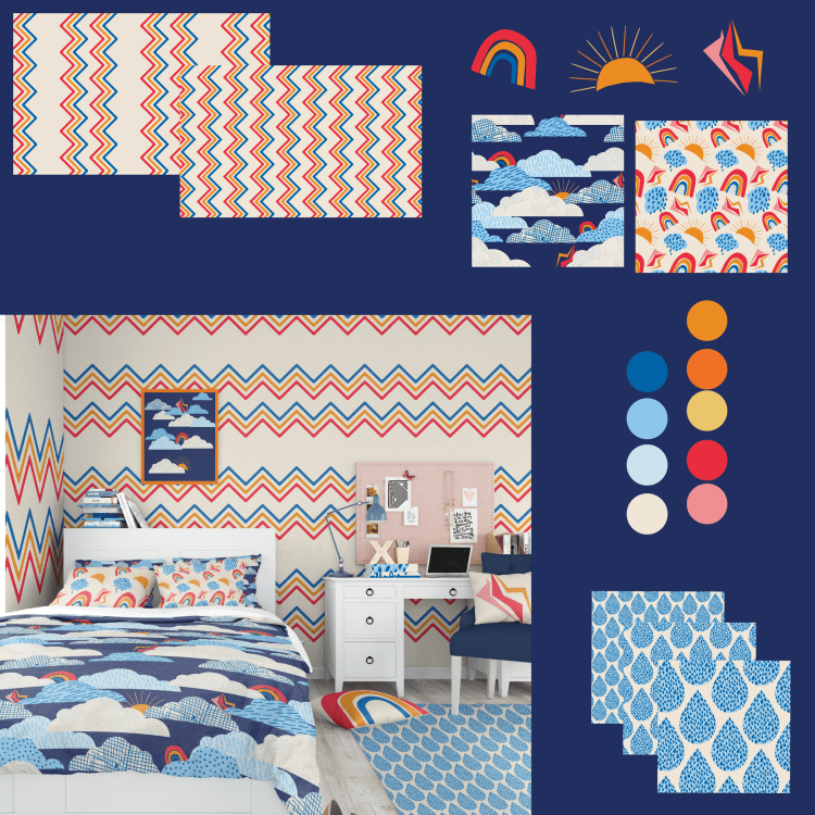
As I stated in previous posts, I’ve been having too much fun finding ways to use these prints and motifs on a variety of products. I decided to put together a mood board with a few of the colors and prints I thought would work well in a room for a preteen or a child.
But now I am thinking this wallpaper might be a little too much for a bedroom. Perhaps it gives off a little too much energy?
Most items are currently available in my Society6 shop. Including the rug and the wallpaper. Click on the photo above to see more products. I’ve been working really hard at uploading more work on a regular schedule and I will continue to keep you posted about the updates here.
Have a good week- hope you are enjoying your summer so far.
Room mock up by Creasty and purchased on Creative market.
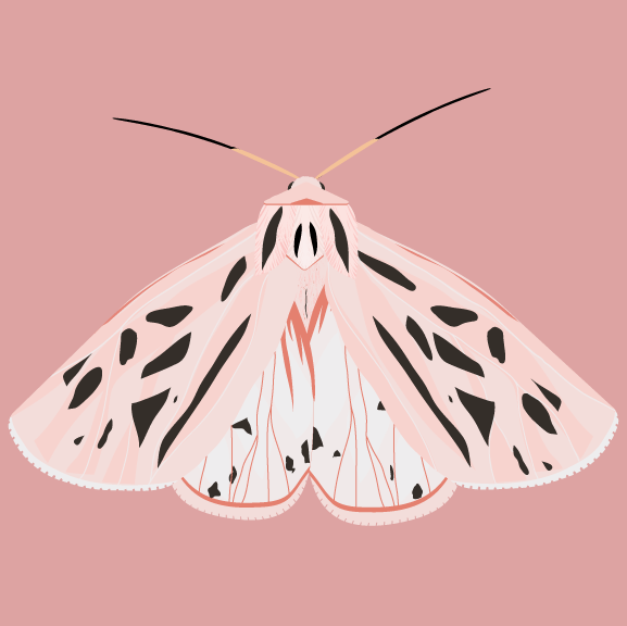
A pretty pink Grammia arge moth, or Arge Tiger Moth, for National Pink Day! Pink is one of my favorite colors though it can easily become one of my least favorites. It really just depends on the shade and how it is applied.
I’ve been working on a little collection of months in Illustrator that I plan to do something with someday; maybe make a pattern or art print, or both, I’m not entirely sure yet of the details.
These sweet little moths range from a creamy color to peachy to pink. I do prefer the pink. It was fun creating the palette for this one.